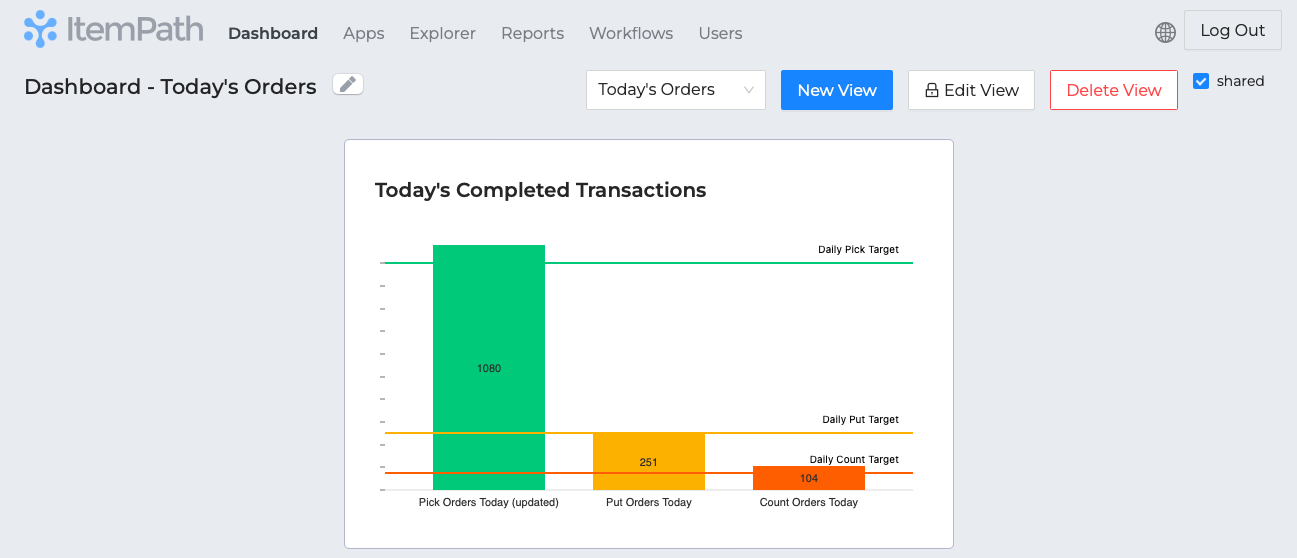
Targets Acquired
You can now create multiple "trend lines" on widgets that use bar charts, giving them a name and amount so you can see if you're hitting your goals! In this example, you can compare your daily order processing rate to your target rate at a glance, using colour coded lines to see if you're on track. Check out the documentation here to set it up on your dashboard.
Your Personal Favourites
You can now toggle a report as a favourite, which will add it to a list of your favourite reports. This is a great way to keep track of the reports you use most often. You can also add a report to your favourites from the report's settings.
Snapshot Subgrouping
We've improved a feature of snapshots that allows you to group data by a field, and then further group that data by another field. This is useful for widgets that can show data grouped by date field plus a secondary field. For example, here you can see how many orders were processed per hour, and then see how what types of orders those were.